 Web design niche has opened multifaceted opportunities for freelances and designers to thrive successfully. Right from the logo design to an effective landing page and branding, the online ventures are regularly in a look out for creative professionals. The web design is no more about the rules and principles alone; it is now more like a fashion statement — highly dynamic and ever evolving. The clients as such shortlist the designers by viewing their online portfolios. Is your portfolio effective enough to strike deals for you? Here are 15 dos and don’ts to help you evaluate the strike rate of your portfolio website.
-
Contents hide
Do: Define Your Goal, Understand Your Objective
Knowing your goals and objectives will help you in designing effective online portfolio. It comes in handy for defining your scope, area of operation and number and type of services you offer. Sit down with a sheet of paper and answer the basic questions like are you willing to publicize your services for new clients or looking for building a network, want to establish yourself as an authority or willing to build reputation, love to design the site as a whole or are flexible with taking up customization tasks and so on.
-
Don’t: Aim at “Open for all”
Freelancers generally do not have a confined set of design activities. They can look after logo design, peep into internet marketing solutions, develop plugins, widgets or themes, offer design and customization related services or even take up copy-writing or SEO projects as well. But when it comes to pitching the market, jack of all trades often evaluates to master of none and doesn’t go well with the audience. It is therefore better to focus on your key areas and publicize the skills (and services) you have mastered over time than including all a huge checklist on your portfolio site.
-
Do: Emphasize Your Work
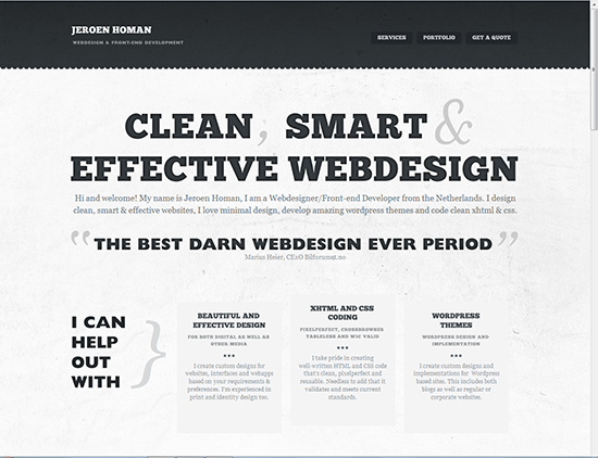
Just get straight to the point. Mention the design & customization services you offer in not more than 2 or 3 statements. Use catchy headlines to describe the genuinity and USPs of the services offered by you. Just like Jeroen Homan’s portfolio implied specificity to catch the attention of visitors.

Specificity: Getting straight to the point -
Don’t: Present Yourself Superfluously
False impression is the sign of failure. Shorten your feature list and keep it to realizable benefits only. Follow the rule even when showcasing your work. Enlist the projects whose credibility lies on you as a whole and in case you include the customization projects mention the part of work undertaken by you. Such disclosures reflect positively on your fame as a freelancer.
-
Do: Showcase Your Work
Portfolio in its literal sense means to showcase the creative pieces of work to impress your potential employers. Similar is the case with web designers. Showcasing your work gives your customers an insight into your creativity and offers them an opportunity to explore your efficacy and efficiency as a competent designer.
-
Don’t: Show Your Mediocre Work
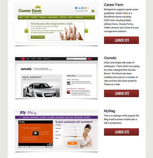
Instead of showcasing 50 good websites designed by you, it is better to show off 5-10 excellent designs. Consider giving a brief description of each design, for instance mention the platform, framework and challenges faced by you along with the screenshots.
-
Don’t: Use Small Thumbnails For Showcasing The Work
Small thumbnails are analogous to visual clutter. They hardly reveal design aesthetics. The visitor is forced to click the thumbnails to get an idea about the designer’s work. This affects the usability of the website.The visitors leave such a website after reviewing one or two designs only. It is a better idea to therefore simplify the design with 5-10 samples of medium size. Check out Dave Wilkinson’s online portfolio as an inspiration for showcasing the work.

Dave Wilkinson's portfolio -
Do: Promote Your Work On Multiple platforms
Open up the ways for welcoming people from various sources. Showcasing your work on platforms like Behance, Dribble, CarbonMade, deviantArt, etc (and providing the links for and on your website) in addition to your own portfolio website works well in attracting the potential employers.
-
Clearly laid out navigation simplifies your website’s layout and structure. It presents the organized view of the website which enables the visitors to explore every nook and corner of the website ranging from knowing you through About Me page, your work on Portfolio page to specifically laid out Services page and contact form.
-
Design and usability go hand in hand. In order to impress the visitors with their creativity, some designers focus on playing around with unique layouts; which may put your navigation panel out-of-focus. This may result in loosing a potential employer just because he could not easily locate the contact page or request form. Such designs are visually appealing but fail to follow the golden rule of usability.
-
Don’t: Give Multiple Options

Multiple Options The purpose of portfolio websites is to gain the clients. In this respect offering limited options (to navigate or take action) have higher chances of striking the deal. For instance, on the services page give a brief description of the services you offer, specify the features and optimize the page for user to take action (like “Get A Quote“, “Hire Me” or “Contact Me“) while suppressing the navigation links. If you offer multiple services, consider creating a separate landing page for each of the services and a unified page for showcasing the work.
-
Do: Establish Authority By Having A Blog
A weblog acts as the platform for sharing the knowledge and expertise. Frequently providing design related tips, useful tools and resources helps you in establishing yourself as an authority in your niche. This raises the confidence of your potential employers while giving you a chance to optimize your website for design related stuff.
-
Do: Tweak SEO For Ranking Well For Targeted Services
Optimize your services page for the targeted keywords. For instance if you specialize in PSD to WordPress or PSD to Thesis, use the relevant keywords in title tag, headlines (h1, h2 and h3), meta-description tag, content and URL of the page. This helps you in ranking well for the services you offer. Also consider using some useful SEO plugins (e.g. Max Foundry’s landing page plugin or Premise designed by Copyblogger media) designed specifically for boosting the SEO of landing pages like your services page.
-
Do: Initiate Contact With Potential Client
Simple, clear and to the point description along with highly optimized call-to-action reflects on your conversion rate. Using the direct speech in the call-to-action like Request Quote or Contact Meand linking it to the contact form helps in generating leads for your projects.
-
Do: Include Testimonials
Testimonials reflect the credibility of your services. Including the testimonials raises the customers confidence and trust in your identity as a established designer.
What are you doing to make your online portfolio successful?

