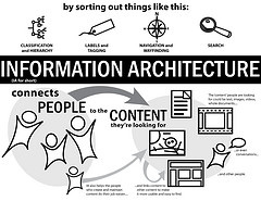
 One of the attributes of a good and interactive web-site design is easy navigation. Your website is the potential source of plethora of information for the searchers. And the simplified navigation panel goes a long way in unlocking the way to this information. Design simple, intuitive and creative navigation panels for drawing the user’s attention and making their way easy to the rest of the web-pages of your website. Take a closer look at various elements, their placements on the web-page and follow these simple tips to make your way for better navigation for your website.
-
Easy Accessibility
The key point to a successful navigation is the ease of accessibility that it offers. You need to bear in mind that each and every web-pages of your site should contain effective linkage to rest of the website. You can provide links to home page and various categories in the header itself. Make use of relevant visual elements in the navigation panel to provide creative solutions to the customer and effective support to the web-site.
-
Internal Links
The best way of retaining a customer is to effectively lay down the links. Links act as the connections to various web-pages to allow a user to unobtrusively explore the various dimensions of the website. Links play an important role and is crucial for both the players – customer/client and owner. It facilitates easy browsing to various pages (for the customer) and customer retainer-ship (for the owner). Insert internal links whenever your website or blog contains any information disclosed in previous posts. Consider providing related links at the end of article to weave the web around your website.
-
Reach
If the path to your destination is short, its chances of gaining a visit increases. Bear that in mind when providing links and navigation aid. Reduce the number of clicks to the destination web-page to one or two. As a rule of thumb, accessing any page of your website from any other page of you website should require no more than 3 clicks. Good websites do this in two clicks.
-
Placement
Place the navigational elements appropriately. Decide on elements to be grouped as primary navigation and secondary navigation and thereafter, position the menus, links and navigation toolbar thoughtfully. Consider placing the menus on the top navigation, primary navigation to the left (to draw user attention; as we read from left to right). Some content centric website also perform well when the content is placed left and the navigation on the right (after all the content really is the meat of the website).
-
The website header and footer areas are of relevance for positioning the navigation menus. Use the header area for summarizing the primary navigation (a glimpse or insight into all your hard-work). Footer region is best suited for providing the secondary navigation and for important disclosures like sitemap, about us, contact us, etc.
