 Textures play an important role in artwork. Apart from the rugged beauty and real life value, textures are an excellent medium for introducing depth and interest in the web design. The applications of textures in web design institution are versatile; ranging from backdrop utility to selective usage for emphasizing the design, textures provide a thematic flow to the design. Along with wise portraiture of colors, creative use of textures help in rendering ingrained aesthetic value to the design. Here are 50 creative examples to exemplify the classic elegance of designs created using textures — either in dense form or as a subtle effect.
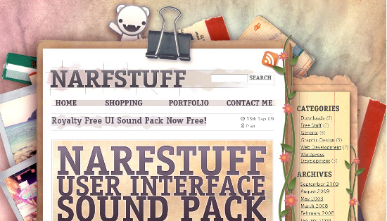
- Narstuff [beautifully placed elements and above the fold colorful texturization renders aesthetic quality to the web design]
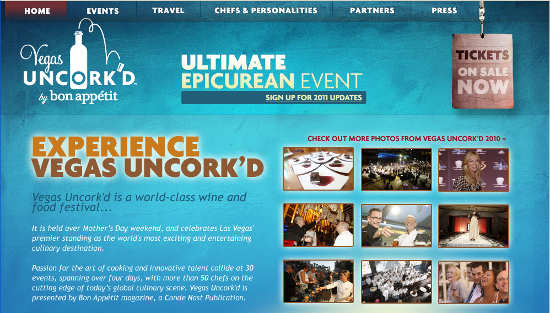
- Vegas Uncorked [the icy blue color in conjugation of gray-blue, effective use of wine color and grain in the background gives it a stylish touch]
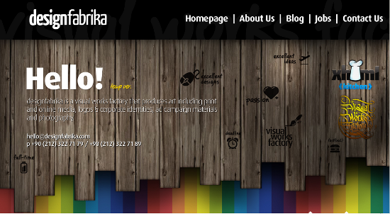
- Design Fabrika [the wooden texture here emulates real life fence; signifying the entrance to the website]
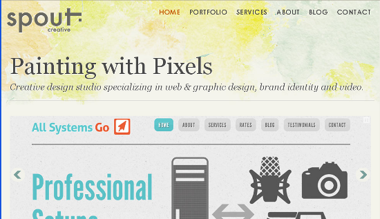
- Spout Creative [beautifully carved web-page with slight texturization of header and footer supported by patterned slides]
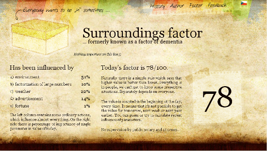
- Icebolt.info [a beautiful portraiture of various textures in varying shades of base color — brown and colorful appeal at the top of the web-page]
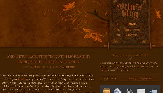
- Min’s Blog [the essence of this outstanding design lies in elegantly textured and beautifully designed header complimented by a simple footer]
- College Park Church [thematic approach of using the subtle textures above the fold and ingrained texture effect to compliment feature blocks and footer]
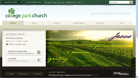
- Jason Julien [justified web designer wall; the design looks great owing to the slight texture around the header (and left sidebar) and the paper-leaf fixed on the right sidebar]
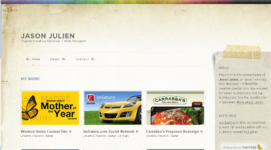
- FeedStitch [relevant texture (cloth weave) and interplay of colors beautifies the design]
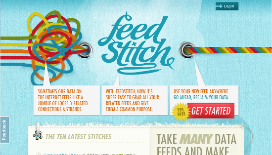
- SimpleFlame [energetic colors and pronounced texture in the header draws the viewer into the web-page]

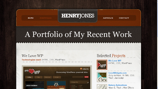
- Henry Jones Portfolio [effectively using the wooden texture as a backdrop to give a stylish touch to the web-page design, limiting the texture effect to the area above the fold]
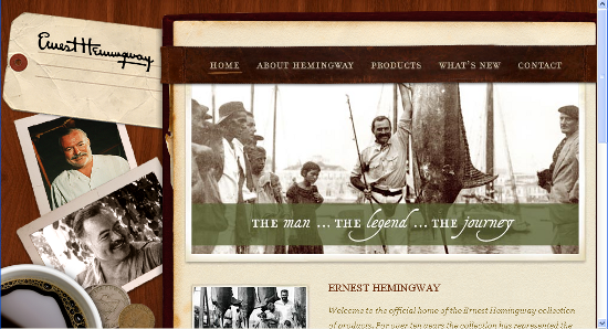
- Ernest Hemingway[the website portrays complimentary textures, giving the classy, timeless effect to the web-page]
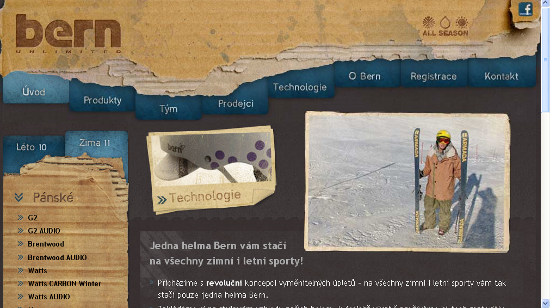
- Helmy Bern [the design brings out the rugged effect owing to the creative use of torn cardboard look in header and for sidebar complimented with subtle grain in content area]
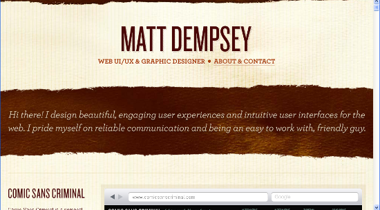
- Matt Dempsey [the website uses a strong theme of using subtle texture as background complimented by heavy textures to emphasize header and footer of the website]
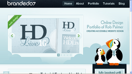
- Branded07 [effective use of shades of blue to portray subtle, ingrained and emphasizing texture effects in the same design; where darker shades of blue with heavy textures aim at attracting the users attention while keeping the texture effect to minimal for content blocks]
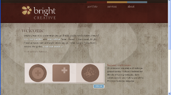
- Bright Creative [a website design with dark yet subtle header complimented with dense texture in content area]
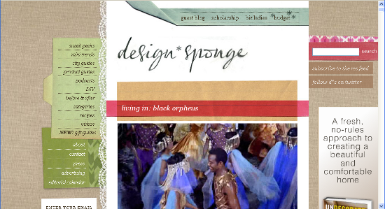
- Design Sponge [an example of effectively using ingrained texture effect in backdrop in conjunction with subtle effects to sidebars and navigation panel with clean white color to highlight the content area]
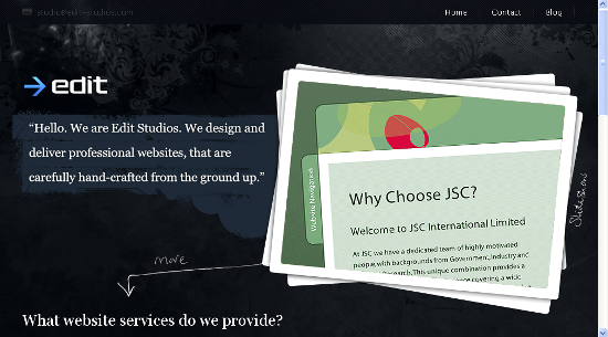
- Edit Studios [a website design using grunge style textures to present an elegant design against the bold beauty of black]
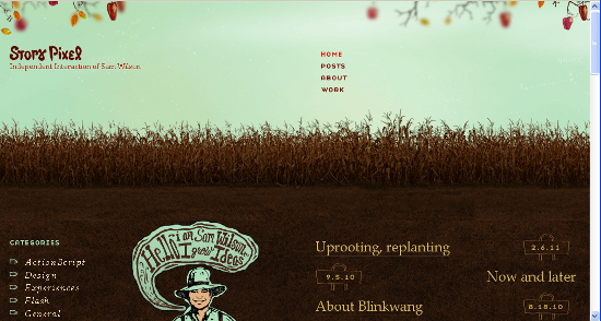
- Story Pixel [natural levels of textures are portrayed in this design; commencing with blue on the top to dark brown which softens to lighter shades of brown towards the footer]
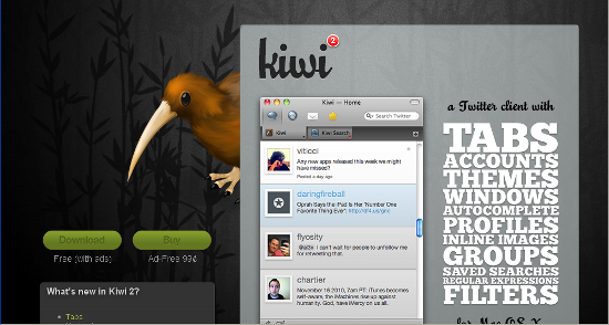
- Kiwi App [an excellent example of portraying the fading effect; wherein the clarity of the background image fades towards the right to render grainy effect which is eventually inherited by the content area owing to the glassy effect applied to the block]
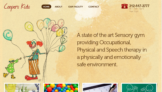
- Coopers Kids [showcasing elegantly laid texture to the upper half of the page contrasted by sharpness of footer]
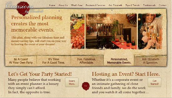
- Occasions By Elizabeth [beautiful textures across the web-page; subtle background, pronounced slider along with emphasized footer]
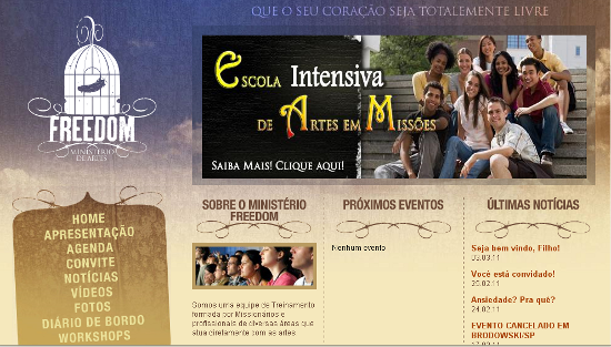
- Ministireo De Artes Freedom [Retro, classic and grainy effect reproduced by mixing of dusty colors with hues of blue to signify the sense of freedom]
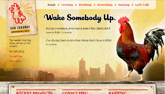
- Wake Somebody Up [a tinge of warm colors above the fold and contrasting portraiture of brown against gray followed by green in the footer makes it a unique design with grain and wooden textures in the backdrop]
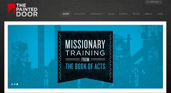
- The Painted Door [the subtle grain of the background is perfectly supported by the textured slides]
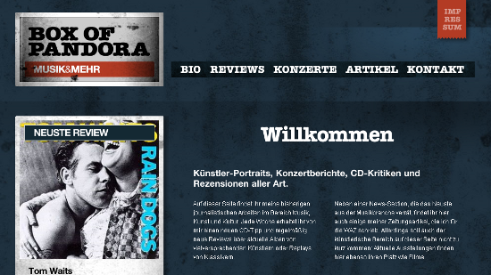
- Box Of Pandora [deep blue and supreme white make a wonderful combination, especially in this example where textures are in foreplay]
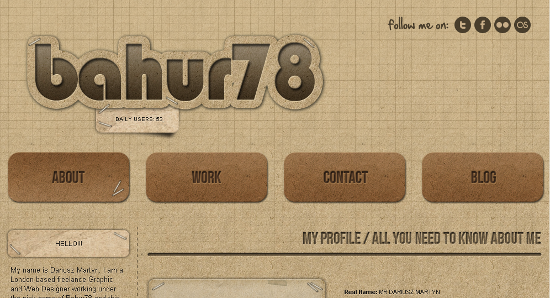
- Bahur 78 [ingrained reality and engraved effect makes the web design superb and the roughness of the dusty background adds more to the richness of the design]
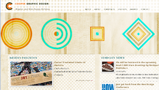
- Cooper Graphic Design [Light colors and elegant textures make this design stand out effectively]
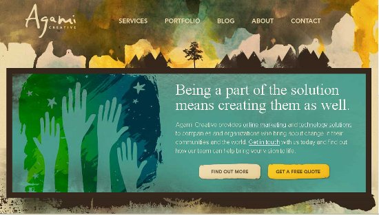
- Agami Creative [an example of gradient of textures, which gradually vanishes towards the footer]
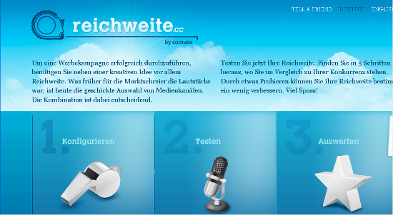
- Reichweite [The white clouds on blue backdrop exemplifies the effect of lively skies which is effectively contrasted grainy gray of the footer]
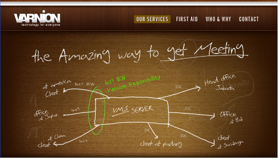
- Varnion [an authoritative design with portraiture of wooden textures only above the fold]
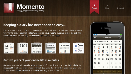
- Momento [wooden textures and glassy effect hold the uniformity of colors and highlights header and footer appropriately]
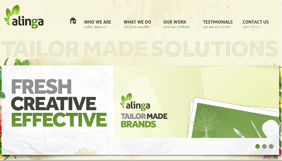
- Alinga [subtle textures in backdrop, selective texturization of content blocks and embossed text effects make this design rich and unique]
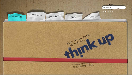
- Think Up [the design brings out the feel of referring a notebook to look back at the old memories and wise thoughts of aged people]
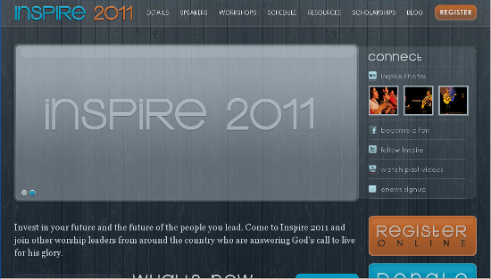
- Inspire 2011 [A gray blue design which captures the viewers attention owing to the patterned-texture in the background]
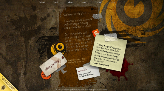
- The Seen [The design ingrains a stylized wall with a door to encourage you to enter the house of the fancy yet serious freelancer]
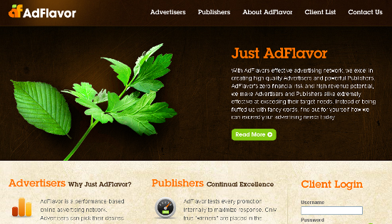
- AdFlavor [the design diverts the attention to certain areas by portraying the effect of light]
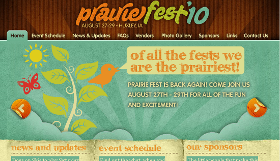
- Prairie Fest [the design portrays the grain across the page in customized color palette ]
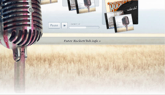
- Rocket Club [a simple design with burning sensation in the footer area]
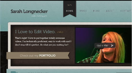
- Sarah Longnecker [subtle texture in header-footer, grunge texture behind the content are and use of faded pattern in content area defines the elegance of the design]
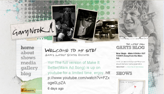
- Gary Nock [textured typography and grainy backdrop photograph compliments each other well]
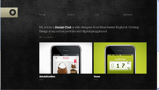
- Corking Design [roughness of background renders glossy shine to foreground images]
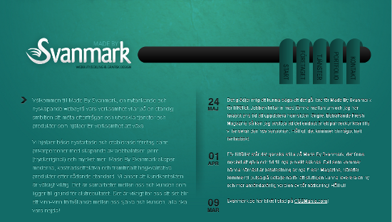
- Svanmark [simple and elegant design with hand-made paper sheet texture]
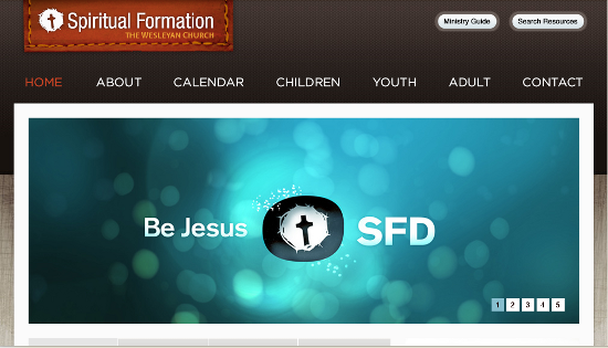
- Spiritual Formation [contrasts in background texture and color renders visual appeal and adds depth to the design]
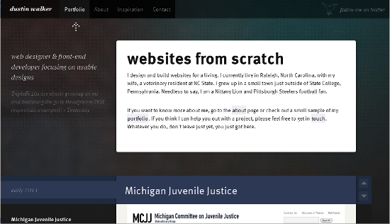
- Dustin Walker [effective use of colors and sophisticate backdrop textures grabs the viewers attention]
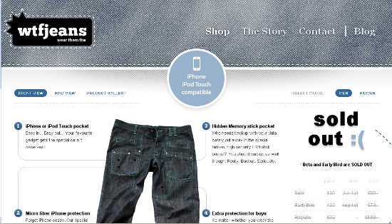
- wtfJeans [the design with pronounced simplicity of denim texture]
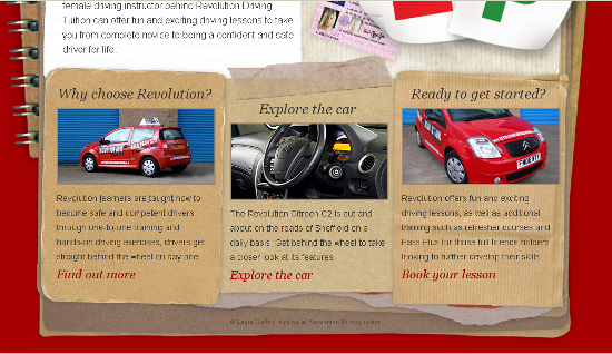
- Revolution Driving Tuition [the center of attraction of this design is mainly the paper craft used for navigation menu and content blocks towards the end of the page]
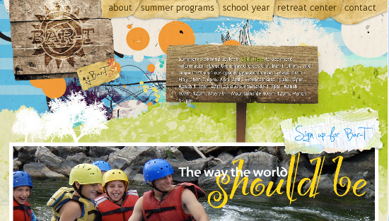
- Bar-T [warm, lively and peppy colors busting on the soft backdrop composed of subtle grain]
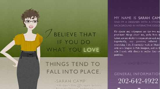
- Sarah Camp [simple and elegant design owing to soft colors and harmonizing textures used on the web page]
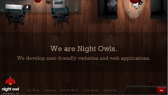
- Night Owl Interactive [varying shades of brown depict intelligent portraiture of wooden textures]
