 Thesis theme framework is one of the premium WordPress themes which offers great flexibility and control over customization of the website. It scores over the other WordPress themes owing to the professional look, pixel-perfect typography and SEO benefits it offers out-of-the-box. Going by the words of the WordPress professionals, Thesis theme is the gateway to killer customizations. But even then, one can clearly spot the websites implementing the Thesis theme by the closely observing the subtle common visual cues shared by the websites powered by Thesis. Here’s a quick wrap of 15 telltale signs, the visual cues which indicate that the website is built up on one of the most widely used WordPress framework — The Thesis Theme. In other words it’s a lazy implement of Thesis and could do with some customization; or perhaps time to hire a Thesis developer.
-
Contents hide
Default Subscription Widget
 The websites powered by Thesis framework by default have a subscription link placed at the top right corner of the web-page. While most of the Thesis users customize the subscriptions options, some leave it as it is to benefit from the default “subscribe” widget offered by Thesis.
 -
The websites implementing the Thesis theme out-of-the-box, reflect the professional look of the Thesis theme with a distinct yet subtle styled header and footer. There is a double-border following the header and preceding the footer. This style adds proficiency to the design.
-
The Multimedia Box
The Thesis framework has an inbuilt multimedia box that allows the users to display audio / video footage or it can be used for adding widgets and advertisements as well. By default the multimedia box appears on the top-right corner of the web-page and users can hide it if they don’t want to utilize the power of the feature offered by Thesis theme. But the multimedia box is one of the smartest feature which is not available (by default) in any other WordPress theme, so you are sure to observe the multimedia box on the websites powered by Thesis theme.
-
Dual Sidebar
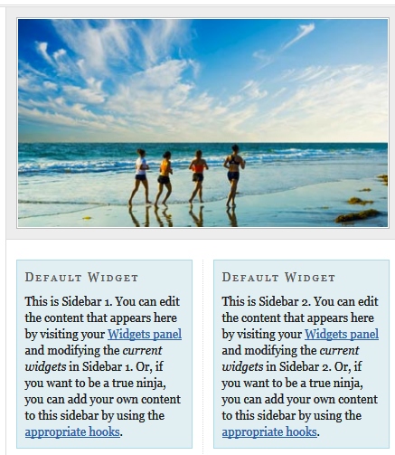
Just below the multimedia box, the Thesis framework features a dual sidebar which can be customized with various widgets.
-
Special Attention On Typography
When talking about the Thesis theme, it is worthy to bring its typography in limelight. The websites powered by Thesis framework surely benefit from the pixel-perfect typography, meaning the types are so perfectly laid out with appropriate leading, kerning and spacing which ultimately helps in maintaining the visual flow of the words on the internet. You will notice that the navigation menu items are all capitalized, sidebar headlines start in capital case and content flow is crisp and smooth.
-
Styled Braces
Thesis theme is known for its typographic perfection and the special character are no exception to it. The Thesis theme uses various styled brackets to compliment the qualitative display of content and text. Thesis features the box-brackets for excerpts and serpentine brackets for comments.
-
The 4o4 Page
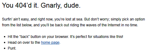
The websites powered by Thesis framework have a uniform 404 (page not found) page and people love to go with is. The default 4o4 page provided by Thesis theme says— “You 4o4’d it. Gnarly, dude“. Check out the screenshot.
-
Default Widgets
The Thesis framework provides default widgets on the sidebar along with a default subscribe widget placed at the top-right corner of the web-page.
-
The footer has an attribution link which says, “Get smart with Thesis WordPress theme from DIYthemes“. The people who use Thesis out-of-the-box seems to be loyal to DIY Themes and credit them for making a wonderful theme which works great even with minimal customizations.

-
Common Comment Form
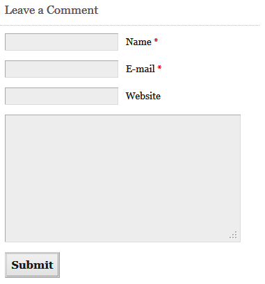
You will notice a comment section followed by a uniform comment form with a double bordered comment button in the Thesis framework. (In fact all the buttons featured by Thesis theme follow this style).
-
Default Style For Alert And Note Boxes
Thesis renders the default alert box and note box with a yellow and gray background respectively.
-
Uniform Post Byliners
After every post title, Thesis provides a byliner which incorporates the name of the author and the date on which the post was published in slightly faded gray.
-
Gray Colored Search Box
The default Thesis framework features a gray colored search box that says— “To search, type and hit enter“.
-
Style Of Blockquotes
The default style of Thesis blockquotes is quite unique. The text enclosed within the b-quote tag appear is followed by a horizontal margin to the left stretching up to the number of lines in the statement. The text of the blockquote stands out distinct in gray colored font.
-
Linking Pattern
The websites powered by Thesis framework follow the similar linking pattern. By default Thesis provides links for for previous post / next post, teasers, excerpts, comments and headlines.
If you are bored of the default Thesis look, contact us for some cool Thesis customizations.
