Effective landing pages and high conversion rates is the buzzword in online marketing sector. While we all invest a lot of time and effort in creating landing pages so that they convert well, there are some fine details we leave behind and focus on the big things. Here are 10 simple to follow and highly realizable tips to make way for landing pages with high conversion rates.
-
Killer Copy
You just have fractions of seconds to impress the potential customers. The visitors are not there to read the blobs of text. They just scan the page and love to conclude the visit, i.e, convert as a lead if they are impressed or leave the page without taking any action. Your content strategy thus should be to present the information in such a way that it catches the eye and impress the visitors at the same time. Using catch lines, simple yet effective statements and a persuasive message is good to go.
-
Minimal Design
“Less is more” works well with landing pages. The more images, icons, content you add to the web-page, the more distraction you introduce. Just keep the page simple and follow “straight to the point” approach. Check out the examples of effective landing pages and decide for yourself what works better. Short paragraphs (not exceeding 2-3 lines), bullet lists and impressive catch lines complement the simple design beyond words.
-
Add Graphics And Videos
Images and videos play smart on rendering aesthetic value to the web-page as it does in enhancing the user experience. The images speak for themselves and implicitly describe the features of your products and services. The videos on the other hand act as a quick look tool to impress and educate the visitors about the products and services by effectively cutting down the crap.

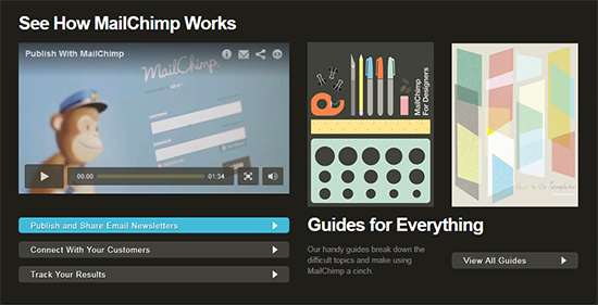
Mail Chimp includes video to explain how it works -
Call To Action Above The Fold
The visitors landing on your page are pretty sure about what they want. And providing the call to action on the first screen itself increases the chances of conversion. Catchy colors make the buttons all the more attractive and entice the visitors to surrender to the call to action.
-
Optimize For Search Engines
Draft your goals for the landing page and accordingly optimize the page by using relevant keywords to describe your services to search engines and people landing on your pages. You can also include the SEO watcher in your dashboard to keep an eye on the ranking of your landing pages.
-
Remove The Clutter
Distractions come in the way of conversions. Exclude unnecessary elements like navigation menu and sidebar ads. Focus on including only the relevant information and link to other services pages, contact pages and request quote forms at the most. Ideally one column layout is good for landing pages.

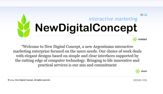
The page links to contact page only: true call to action -
One Goal Per Landing page
Copyblogger in one of its articles reports that there’s an old direct marketing axiom that states too many choices paralyzes your prospect into complete non-action. The same thing applies to the landing pages. If you provide too many options to the visitor, he gets confused and leaves the page without taking any action. If you are offering various services and products, creating a separate landing page for each of the services / products is the sign of healthy conversion strategy.
-
Lead The Eye
Judicious use of white-spaces, catchy colors, large fonts and mixed types help in leading the eye of the visitor towards the call to action.
-
Extended User Engagement
The primary purpose of the landing pages is to lead the potential customer to the path of conversion, you can always use the landing pages as an effective medium for offering diversified paths to the customers to remain in touch with you, probably through social media networking or by subscribing to newsletters and RSS feeds.

Using the social media icons for extended user engagement -
Reinforce Credibility
Including the testimonials, partners, visual customer support options in the footer help in establishing trustworthiness in the customers eye.
Check out the article on creating landing pages in WordPress for a systematic approach for laying down the architecture / blueprint of your landing pages.
What are you doing to make your landing pages effective?
