 2012 has been a buzz with a lot of new design trends evolving. Here are 10 such things you can do to give your website a modern touch. Before we begin let’s demystify some tech-banter.
Responsive — A site which works on cellphones? Nah. They all work well on cellphones. They work great and they are just fine. No problem with them. The word “Responsive” is used to refer to a site (design) which responds (adapts) to the screen size it is being viewed on. On a smaller screen, may be the sidebar can go and font shows up a little larger etc. May be the menu is reordered to occupy less space on the small screen. There are many things you can do with media-queries to detect the screen-size and render the design which suits that size the most.
When a prospective client demands responsive design from me, it scares the **** out of me. In the name of a responsive design, they could be referring to almost anything (and they will never be able to tell whether the design is responsive). Yes, they all show up fine on smaller screens, iPhone, Andriod, Windows, Firefox etc. Why in the world would anyone design a cellphone/browser which cannot render websites just fine by default? Apparently the term responsive is the most abused in this sense.
CSS3, HTML5 and responsive design have re-defined the web in 2012. While there has been too much of responsive design stuff around, cool CSS3 features have added a touch of modernity to the websites. Let’s check out all this stuff here:
- Responsive Video
You can now put a video frame on your website, that will re-size itself proportionally with respect to the size of the browser window. You can learn how to make embedded videos responsive here. - Responsive Image
Just as the responsive video, responsive image in your website will get re-sized proportionally as the viewers re-sizes the browser window. This can be achieved by applying 100% max-width and setting the height to auto. Refer this article for more. as shown here. - Responsive Slider
Almost every website today has an image slider. But only a few of them are responsive. You can make the sliders responsive by following the steps in this tutorials. - Responsive Menu
Responsive design has a responsive menu as well. You can create various styles for the navigation menu for different device-sizes. When designing for a 340 px screen, you can shrink the menu to a clickable button and for 720 px, you can expand it to show up in two columns. Check out this tutorial for a step-by-step guide for creating responsive menu. - Responsive Media Query Generator
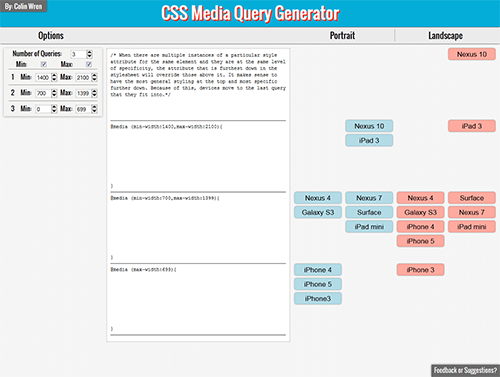
Do you find it difficult to generate the media queries for various screen sizes? You can use a media query generator which will generate the media queries for you. However you’ll have to fill in the spaces yourself, i.e, you will have to write the device specific CSS for the media queries. You can get one such media query generator here.

- Responsive Column Layout
As we said earlier, that responsive design is all about adaptability. When switching to various window sizes you may want the column layout to change from three to two or may be one for smaller screens. Generally, three column layout is designed to work as one-column layout for smaller screens, therefore the sidebar is shifted below the content column. Looking for a quick way to implement responsive columns. Check it out here. - CSS 3 Transitions
CSS3 has just begun to allow you certain basic yet fancier effects without the use of external libraries. Multiple background images, CSS3 transformations, border with images, CSS3 transitions, etc are some of the most handy CSS3 features (check out some cool CSS3 features here) and CSS3 transitions stand out distinctly among them. It allows an element to gradually change the states — from one style to another. Does your site useCSS3 transitions? Learn more about it here. - Modernizr
Modernizr is a Javascript library which provides progressive enhancement to your base site for CSS3 and HTML5 features. Want to “modernize” your site? Ask your designer for it. - Parallax Effect
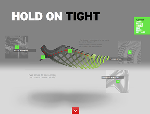
While looking out of the moving car window, you can notice nearby things moving faster than things at distance. The same concept has been prevalent into 3D games and it has now come to web design scrolling. Two layers of different images are placed one over the other. When the page scrolls, one layers scrolls faster than the other creating a parallax effect. Check out the demo of a parallax effect here and learn how to achieve parallax effect here.

- HTML5
HTML5 is fifth generation HTML. It comes with many new things like support for the <audio> and <video> tags, etc. HTML5 support on your website relieves you off adding iframes for videos. You just need to include the video link and the rest will be taken care of by HTML 5. Isn’t that cool. [Learn more about HTML5 here.]
There are many other web technologies, that are available today and are making designers’ life easier and making the user-experience all the more lively. Want to modernize your website? Contact me.
