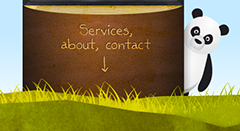
 Web-designers concentrate on designing beautiful headers, style the web-pages with various effects, include the showcases and image galleries, design striking logos, etc. As the web design principle, they pay attention on all the elements above the fold and reserve the footers for disclaimers or use it as the secondary navigation. The latest trends have however transformed the way people utilize the footers. The urge to style the web-pages creatively serves as an inspiration for styling the footers, perhaps by including classy illustrations, exquisitely designed contact forms, social media interactivity options or by using it as an About page (or by regularly updating the footers with recent blog entries and blog-rolls). If you’ve got everything, it’s perhaps a beautifully designed footer which will give your site an edge. Mostly neglected, the footer can been made excellent use of to enhance the visitors’ browsing experience. Here are 42 examples showcasing the creative ideas for designing the footers.
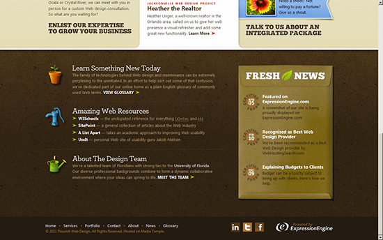
- Florida Flourish
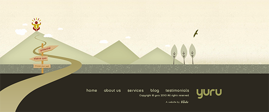
- Yuru Inspires
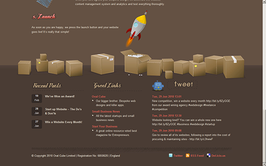
- Ready Made Designs
- Split Da Diz
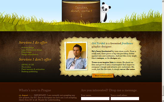
- Jiri Tvrdek
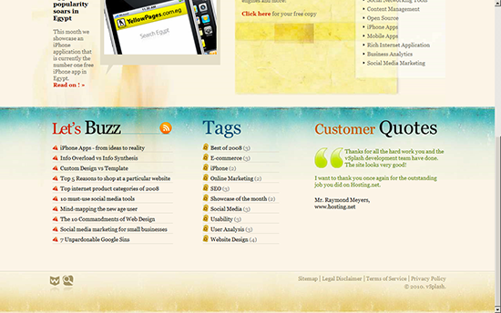
- VSplash
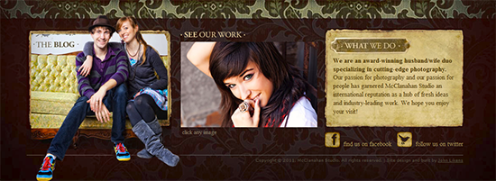
- McClanahan Studio
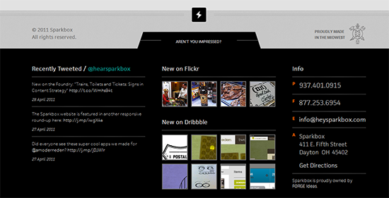
- Sparkbox
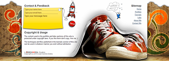
- Mecannical
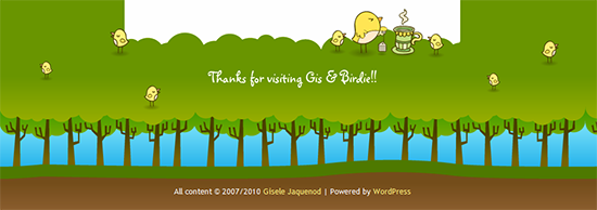
- Gisele Jaquenod
- Madfrog Designs

- Sid05

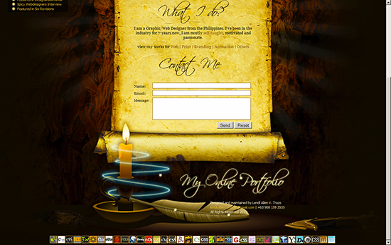
- Lendl Allen V Trazo Online Portfolio
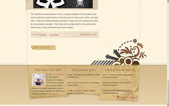
- Spoon Graphics
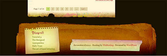
- I Love Colors
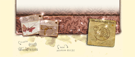
- Wire Roses
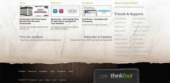
- Think Design
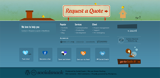
- Social Snack
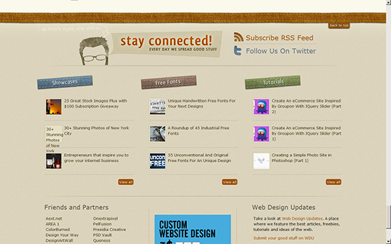
- PVM Garage
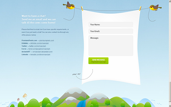
- Oman Clarke
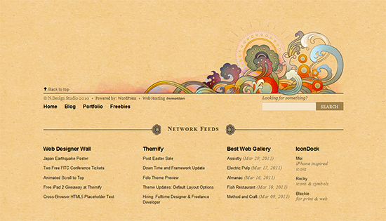
- N Design Studio
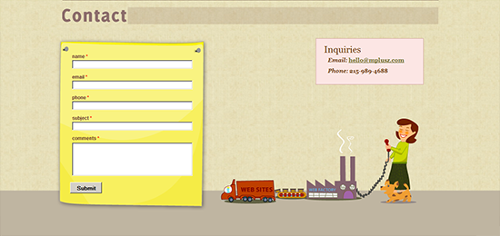
- MPlusz
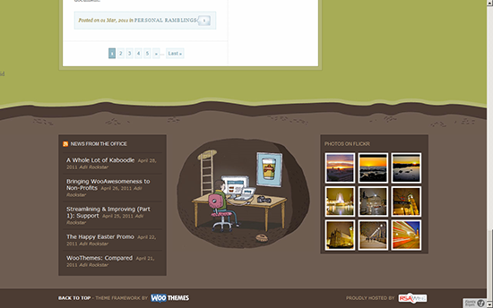
- Mark Forrester
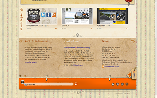
- HEBAtec Internet Systems
- Launch Mind

- Freelance Switch

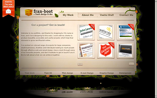
- Fran Boot
- EctoMachine
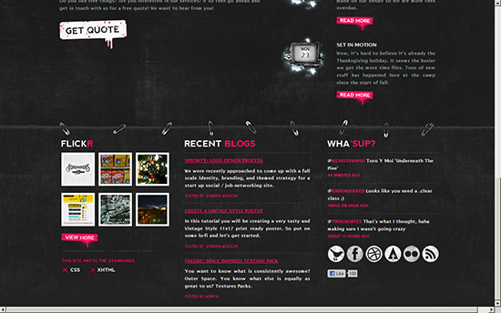
- David Hellmann
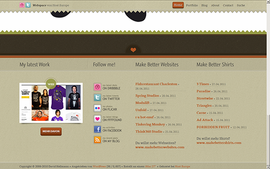
- Chris Sharp Design

- Yodiv
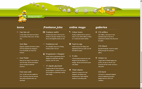
- Primstone
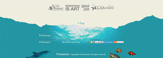
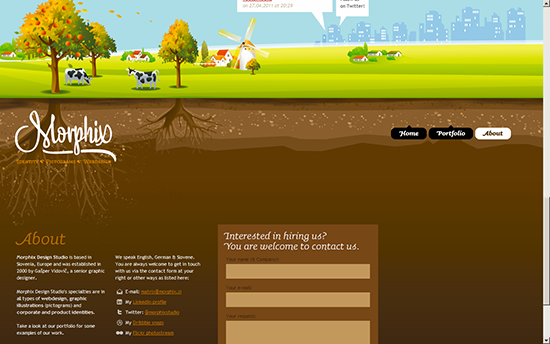
- Morphix
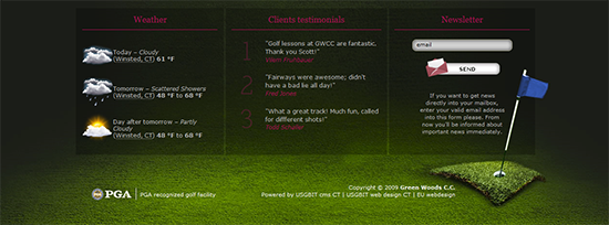
- Green Wood C. C.
- AnswerJam

- Edge Point Church

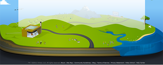
- Vimeo
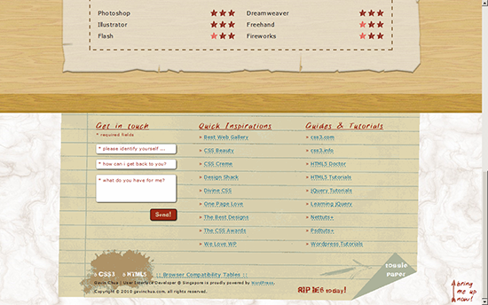
- Gavin Chua
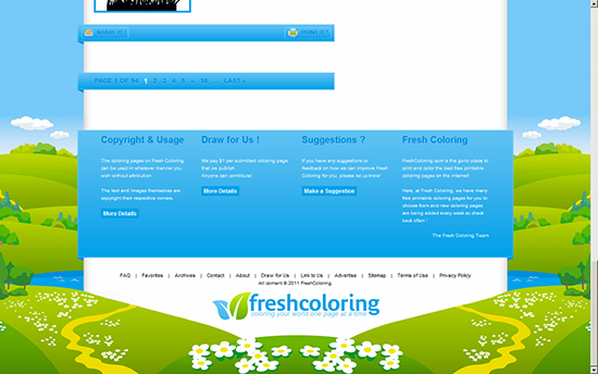
- Fresh Coloring
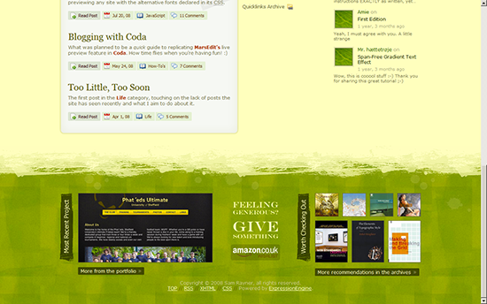
- Sam Rayner
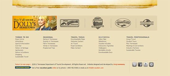
- Tennessee Vacation
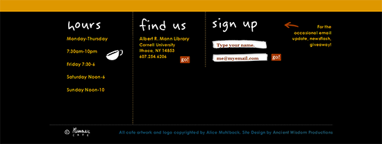
- Manndible Cafe
How does your footer look?
