 Photography enthusiasts love to photograph shallow DOF to blur the background. Blurred backgrounds add three dimensional reality and a little bit of surrealism to the image. And the effect comes out to be quite impressive — sharp & focused subject and complimenting defocused background. As an inspiration from photography, designers have also started following the trend of blurring the backgrounds; but with a different purpose and intent.
In web design, blurry backgrounds come in handy for designers to make an impact with typography. Blurry backgrounds here act as an ad-hoc for attracting the viewer’s attention towards the beautiful types laid on the image.
Try out a simple exercise. Open an image in Photoshop and add text to it. Try adjusting the font-size, font-weight, drop shadow, outer glow and the likes to make the text stand out distinctly. And now just add a little blur (Filter > Blur) to the image. Observe how drastically the readability of the text improves by blurring the background. The focus of the viewer shifts from the image to the text.
Photoshop makes it fairly easy for you to try various types of blurs; lens blur, Gaussian blur, radial blur and motion blur. Play around with blur settings to see what works best for you.
However you don’t always need to blur the background completely. Sometimes you can use selective focus and other times you can try out tilt-shift effect as well. Here are some examples of the same — the blurry backgrounds in web design.
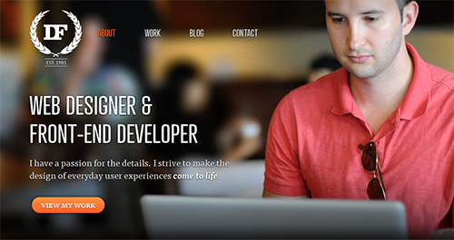
- Daniel Filler
- Do – Get Work Done

- Happytables

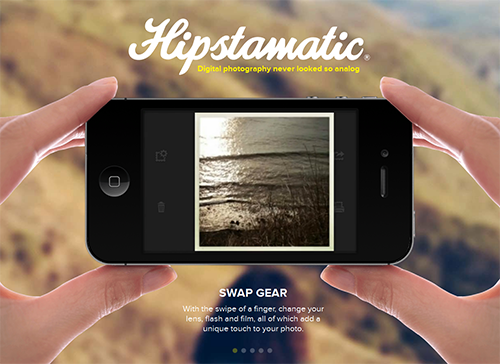
- Hipstamatic
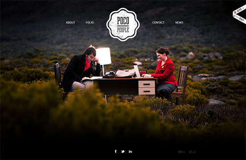
- Home POCO PEOPLE
- Humaan

- ITrackMyTime APP

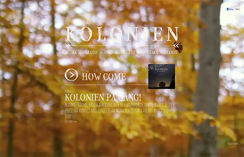
- Kolonien
- Noe-interactive

- Square

- Pine Trail Mountain Bikers

- Cage

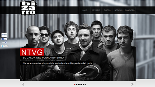
- Bizarro-Records
- 101 Airborne

Have you employed blurry backgrounds yet? How about including them in your next design project?
