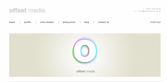
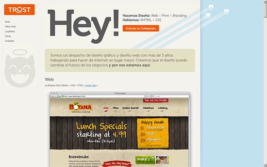
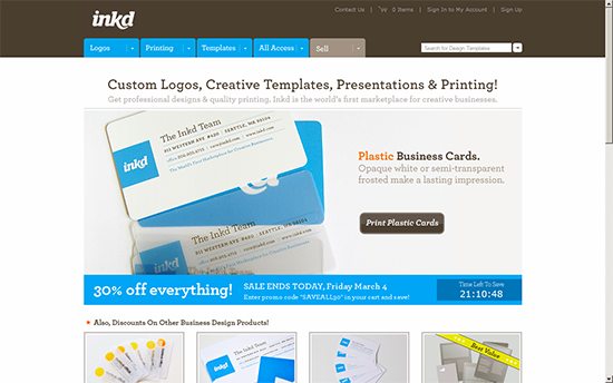
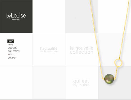
 Most people easily get turned-off when they come across complex and confusing things. This also implies in case of websites. Clean and simple web-pages tend to attract more visitors, hold the visitors longer and have a higher rate of conversion. Here are some tips to create a clean and simple web page.
-
Enhance Readability
The web design principles voice that the web-page should be easily readable and scannable. Having some hands on knowledge of typography thus paves way for beautifully carved text on an ordinary web-page. Try to avoid any complex font which is difficult to read and try to keep the font-size sufficiently large so that it is scannable with a casual glance. If you need to use smaller font-size, go with a sans-serif font. They are simpler and maintain their legibility at small sizes. While most of the common fonts are designed for good readability, take care of the vertical spacing of the lines of the text. Known as leading, this can make or break the visual flow of the content.
-
A Simple Color Palette
It is ultimately the power of the color which makes the web-page look neat, clean and simple. Using the pastel shades and watercolor effects in the website design helps in reducing the tension and gives soothing effect to eyes. If your website is content-based, using white background to support the black colored font is an ideal match. Whilst you can also use subtle and light shades of hues to integrate branding, design ethics and color scheme of a web-page.
-
A Layout That Compliments The Content
The layout which you are going to use for your web-page should be simple and professional. It should have proper color contrast, intuitive navigation and acceptable width (as users hate to use scroll horizontally). The following tips come in handy for better readability and good composition of a web-page.
- Maintain The Word Flow: A single line should carry about 8-9 words. Having more than this will hinder continuance from the new line. Having fewer words will be more interruptive to the flow.
- Creative Placement Of Elements: A web-page is a hub of a lot of information, call to action and inclusion of various elements as navigation links, images, advertisements, etc. Placing the elements aesthetically on the web-page requires some basic knowledge of composition rules, whilst breaking the rules and design principles is favorable for creative and unconventional web designs.
- Eliminate Distracting Elements: While images etc. add to the look, feel and the cosmetics of a web page, using too many images can break the reading flow and distract the visitors. Animations are absolutely undesirable inside text based content.
- Present A Valuable Design: Create a valuable design by minimizing the number of elements and also by keeping the size of page to bare minimum. Try to keep the content short and precise or perhaps uniformly divide the content over pages and save the page form over-stuffing. The design and layout should be created keeping in mind the average screen size of the visitors’ screens.
-
Respect The Semantics
HTML is easy to learn and use; and the same fact applies for it being used casually. Making the website interactive, aesthetic and emphasizing the front-end is hypothetical unless you understand and imply the importance of clean code. It does not contribute in beautifying the front-end but plays a crucial role in developing properly structured and compatible websites (and comes in handy for maintenance and debugging). This helps the browsers and search bots to display and index the information with it’s contextual significance.
-
Learn From The Examples
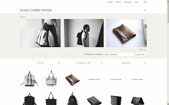
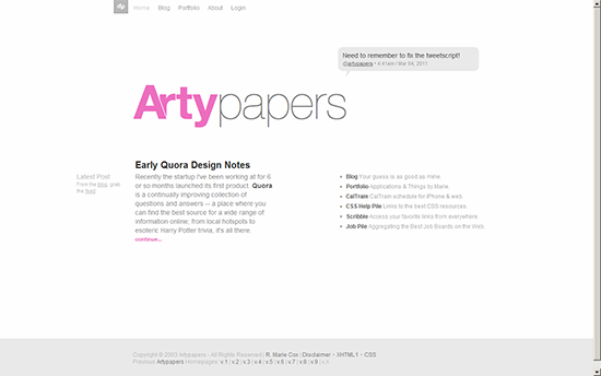
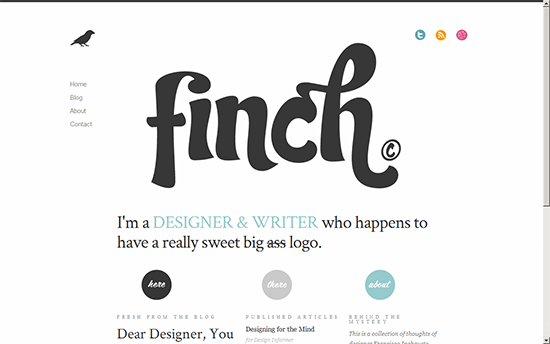
Web-design is a creative art which nourishes with experience, experiments and inspiration. While the above-mentioned tips and techniques play a crucial role in designing clean and simple websites, here are few examples to help you generate a elegantly beautiful, clean, simple and creative website.
