 Most of the website design (cosmetically) is “above the fold”. While it is often not desirable to spice up the text content, the web designers often ignore or neglect the effectiveness of footers when designing the layout. Conventionally, footers are reserved for concluding the visit to the website perhaps by including the contact info, disclaimers, copyrights, “go to the top of the page” link and so on.
Modern designers’ inclination towards unconventional designs has made the footers all the more desirable for engaging the visitors. Apart from the common elements, designers focus on including a number of things in the footer to increase the usability of the website and enhance the user-experience at the same time. Here are 23 such elements that you can add to your footer to make it a power-footer.
-
Contents hide
Archives / Categories
When the user scrolls to the bottom of the web page, it probably means that he is interested in exploring the the website and the content. This is where the archives and categories help him in finding the stuff that interests him. The archives provide the visitors an easy way to navigate the website from the footer itself.
-
Search Box
Adding a search box in the footer enables the visitors to search for specific content, services or information about the website. It is particularly useful for new visitors who are more prone to scrolling and scanning through the pages.

-
Social Media
Instead of cluttering the sidebar with social media icons, consider footers for social media marketing. The footers are the best place to conclude the visitors impression and so placing the Twitter and Facebook buttons in the footer will boost the level of marketing for your website.

-
Link to Groups / Forum / Discussion Area
Website designers are always in search of good inspirations for their designs and showcasing their own creations. Flickr group is one such pool that designers use to share their designs.Link your footer to a Flickr group and let visitors discuss and flaunt your website design.
-
Blogroll
Add a blogroll to your footer and share the links to blogs of your choice with others. If the blogroll incorporates high ranking blogs, the ranking of your blog in the search engine will increase automatically. And a good SEO ranking means good traffic.
-
Logo
A skillfully designed logo gives a professional look to the website and increases its credibility. Adding a logo to your footer will leave a long lasting mark in the sub conscious mind of the visitor before he leaves the web page and will help him recognize your brand whenever and wherever he sees the logo.
-
Editor’s Note
A footer note from the editor about how to use the website and its contents makes the user well aware of the conditions and limitations of using it. Often an editor’s note states that the contents and images of the site can be used freely by the visitors but attribution must be given to the original site. The attribution links increase the traffic and reputation of the website.
-
Advertise Your Services
Renting space in your footer for advertisements will fill up vacant gaps, make your footer more attractive and provide you with a source of additional income as well.
-
Newsletter Subscription Form
Including a newsletter subscription form in your footer will enable your visitors receive latest updates from your website and increase traffic.

-
Recent Comments
The best way to know the credibility of your website is through constant feedback from the visitors. Adding a list of recent comments in your footer will increase the interest of new visitors.
-
Affiliate / Own Products
Affiliated products that are of relevance to your website in your footer can help you make more money from your blog. In addition, including a list of thumbnails of your own products in the footer to expose them once more, is not a bad idea either.
-
One Line Editor Bio
Even after creating a smashing website with superb layouts, catchy images and absolutely useful content, your job is not done. People like to know about the editor of the blog/site as well. Add a one line bio of yours to the footer that explains your personality- entirely and concisely.

-
Random Quote / Gallery / Inspiration
Adding a random quote at the end of the page in the footer gives an artistic and professional feel to the website. Similarly, adding a gallery/slideshow will make a hold on the visitor , inspire him, beautify the website and increase page view rate.

-
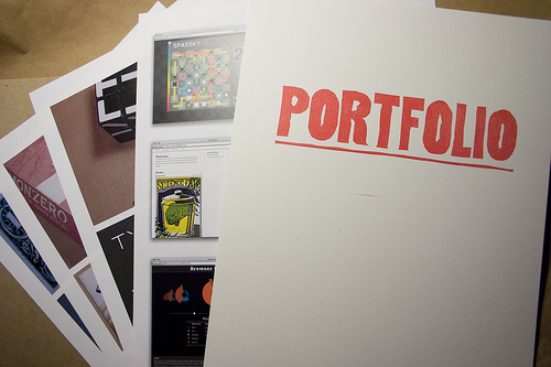
Mini Portfolio
Whatever be the theme of your website, you can always provide a link to your portfolio in the footer to showcase your talent, products or services in detail.
-
List Of sponsors
If your website is being sponsored, list the names of your sponsors in the footer. This will encourage other sponsors to participate and flatter the present ones.
-
Advertise Design Services
If you are a web designer, advertise your design services in the footer to attract clientele.
-
Poll
Including a poll in the footer will let you survey and know client/visitor’s point of view towards your website. This will enable you to know about the most preferred topics and also provide constant updates for new topic demands.
-
Top Gear
Including a list/thumbnails of latest / recommended products in your footer will keep the visitors informed about the current product updates.It also shows upon your knowledge and information about the industry and current market.
-
E-book Ad
Include your website’s e-book advertisements in the footer to increase publicity of your e-book (if you offer one) and boost traffic.
-
Stay Connected
Include a widget in the footer to indicate your online / offline status to the visitors. This allows easy communication to your clients.

-
Conventional Elements
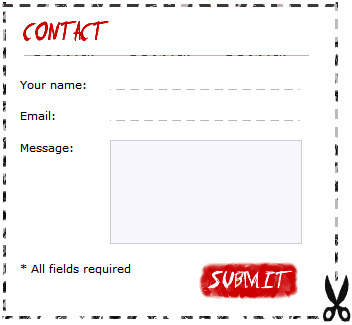
Do not forget to include the age old but highly important elements in your footer like mini contact form, categories, tags, secondary navigation menu, copyright information etc.
-
Secondary Menu
A secondary menu is not a feature per se, it is a critical element of any good design. It allows easy access to navigation which the visitor left above the fold. If you do not want to include an entire menu you may only include links to home, about, contact & sitemap pages.
-
Testimonial For A Product / Service
If you are offering a product or a service, the footer is your last chance to pitch the product. What better way to do that than to include a catchy original and trustworthy testimonial? Include a “scroll back to top” link too just in case they don’t want to reach too far out for the scroll bar and drag.
A dull and uninspiring footer will repel visitors regardless of what you have in it. A vibrant, colorful and catchy footer will grab the attention of the visitors as soon as they scroll down the page. To view a gallery of footer designs, check out our other article “Awesome footer designs”.
