Part 1 was about Thesis and you can read it here.
All this while when I was working with Thesis, I had noticed some people pitch Genesis. I looked at the demo several times. There was no way in the world it could match the typography of Thesis. Someone just didn’t have a clue about what a vanilla design should look. Nothing was aligned. The dark logo looked evil. Horrible choice of settings. I didn’t like the way things worked. The sites built on it didn’t really impress me. It was a different flavor. But eventually I mustered up the courage to spend on a Pro Plus license.
Genesis was different. It was a WordPress theme built for standards. It was compatible but didn’t look much… until I grepped into the code.
For the absolutely horrible first time impression, it though made up for it with the child-themes. With some nice ready-made child-themes you could just begin, tweak things and get things up and running. It was GPL too. The overall impression was that these were the good, friendly guys–the team behind a standards-compliant theme.
Once I got my own site running on Genesis, with all the experience getting things up and running, it wasn’t long that I was a Genesis wizard. I started taking projects and started delivering them on Genesis.
But most of them didn’t help finances much. Right at the time of delivery customers would ask me to change column widths and it would take hours to fix the widths and get the responsive part working again. All this overhead cut into the business.
I looked into Prose. It had way too many settings. The funny thing was that the settings were not well tested and some settings just didn’t work. And the settings that truly mattered were missing. Prose could have been Genesis’s answer to Thesis. But it was botched up well beyond usability.
I tried some of the starter themes out there, but none impressed me. My standards are different. And I generally don’t build my business and services on something that I don’t use myself (let alone recommend it). It was time to build something that I could use for my own site to help port it to Genesis. And once I was sure I could use it on my production site, I’d be ready and confident about powering my customers’ sites.
I started with a very basic child-theme, but one that would live up to my standards of typography, minimalism, alignment and eye for detail. And it must allow me configurable layout widths. And they shouldn’t break when I’d change widths. Heck, I wanted the configuration such that it wouldn’t break the responsive part also, even if I changed widths later. That wasn’t many features but definitely quite a challenge.
Lander was born. The rest of this post is about my rants about Lander. But Lander is the gold standard of a theme that would allow me configuration, ability to build custom designs, have mobile specific views not just responsive, allow me awesome landing pages.

I wanted more than what Genesis was offering at face value. And after my sites were running Lander, we introduced font configurations, and some basic design settings that almost every new project needs.
I made it bbPress ready because I use bbPress here on Convertica. But then I got a project for WooCommerce and we made Lander WooCommerce ready. We got more projects and we delivered them on Lander. Some projects from the middle-east and we made it RTL, another few from some European countries and we turned Lander translation ready.
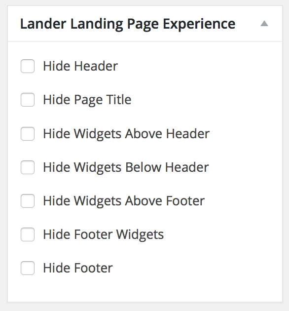
I always take customer feedback very seriously. But with Lander I went a step ahead. I’d watch and compare the old SERPS and see how the new design affected my customers’ business. And I’d push Lander to new heights based on customers’ feedback and their success. So we implemented landing page sections. We made them such that we could hide header, footer such elements on page by page basis to create minimal looking landing pages tweaked for conversion that was actually measurable. And we didn’t stop at that.

We spent months to get the landing pages right. Unlimited full width landing page sections was one thing we wanted to implement. I played with CPTs for months but I wasn’t happy with the permalink structure. Finally when I did get it to work, I didn’t like the hack that the code was. So I redid them from scratch after months of effort.
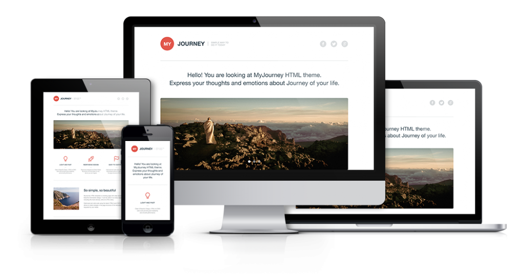
Earlier this year Google sent an ultimatum that it was time to go mobile friendly. So Lander was updated to go beyond a responsive view and take care of the mobile port at a template level – it must show minimal markup on the mobile port in the first place. So we left behind all that buzz about mobile first and actually built Lander such that it would be mobile first but only after checking that the viewport was actually mobile.

As if that wasn’t enough, I wanted a configurable mobile view so that I could just visit the settings and turn on a off certain elements only on the mobile viewport.
But what would happen on pages that needed specific tuning like landing pages? So we additionally made it configurable globally and on page-by-page basis.
Finally I wanted to have the Google web fonts integrated into the heart of Lander. That would allow some tremendous ability to radically change the design with minimal effort. Lander finally got 700+ Google fonts built in.
I sat back and wondered… Lander is what Genesis should have been. No doubt Genesis was done by some of the best coders. But good coders are so full of themselves that they put code above everything else. I put the customers first.
Lander was my manifestation of Thesis 1.x. And after enjoying the success we delivered with each project powered by Lander we planned to launch it to public.
Lander has a beautiful minimal canvas to start building a new design on, has an impeccable set of settings that one can’t live without and each of those works. With powerful landing pages, mobile view, Lander also comes SASSified that allows us to design intelligently. If that sounds like a lot of promotion, buy lander and find out for yourself. It’s a power-user’s theme. If you feel lost, stick to a pre-cooked child-theme.
Genesis – The Good Things
Genesis happens to be one of the standards compliant frameworks. It though needs some fixing to be compatible with WooCommerce and bbPress. Also you need quite some tuning for Genesis to be usable – align margins well, some vertical alignments also and may be more. That’s the reason every developer has their own starter theme. There are other plugins and themes that allow dummies to get started like drag-and-drop themes or themes with a kitchen sink of settings and all. But once you get started, Genesis comes with rich hooks and filters. And as a developer you’d be very pleased with the available hooks and filters. There are some excellent plugins built for Genesis that allow you to take it to the next level.
The GPL Story
Genesis were one of the developers whom we ran through our GPL test. Sadly no happy news there. GPL is pretty much a paper-stamp and that’s it.
The Genesis Community
The Genesis community is built of people who actually are impressed by the ready-made child-themes than anything else. This creates a never-ending cycle of issues – customers keep coming up with customization tasks that they need help with. Most of them are child-theme specific. So these query grow exponentially with every new child-theme.
A small portion of these people dive into the code and are able to make use of code. These ultimately mature into developers. And some of them help the customers. Others go into the never-ending cycle of trying to customize the child-themes and finding a solution and then hit another customization task. I assume a larger part of the Genesis ecosystem is built on that phenomenon.
Getting on the team of Genesis developers is quite a trick. If you are in a part of the world where you can’t meet them personally and shake hands, it’s impossible to make it to their list.
At the end of the day what matters is that as a developer you have a framework that allows you to deliver projects with max utilization of your time. I’ll be honest. Developers are creative people and they hate the boring stuff that involves doing it all over again and again… reinventing the wheel etc. Genesis is flexible. But since I do custom design, child-themes don’t cut it for me. The work involved in taming them is beyond justification. And I don’t like to reinvent the base with a starter theme every time. I made it usable with Lander. I just launched a new site: http://goo.gl/PPnhGV. And it was done with Lander in 4 hrs flat.
