 A website is the backbone of your online profit generation. The ultimate purpose of creating a website is to get good returns. If your website is far beyond your expected returns, there are certainly some flaws in it. People often opt to go for a website redesign as such. But does your website really need a redesign? Here are 15 tips to help you decide.
-
Contents hide
Poor Traffic Stats
The most important factor that decides the success rate of a website is its traffic drive. The number of visitors and customers decide the fate of your website. But if your website does not have a high traffic attraction, it is bound to fall back in the search engine ranking which will highly affect your returns from the website. Additionally your traffic analytics should allow you to know the bounce-rate, visitor loyalty and other critical parameters. If your website is facing a problem in any of these areas, it’s a good indicator that your website needs a redesign.
Google Analytics comes in handy to analyze the traffic sources, content popularity, visits, pageviews, bounce rate and average time on site providing a pretty accurate overview about how your website is doing.
-
Outdated Technology
Is your website still running on HTML? Is it lacking an RSS feed? Does it allow interaction, feedback and social sharing? Do you need your designers’ assistance for updating the pages or for creating a new one? If the answer to the above questions is “yes”, it is surely the time for a redesign.
-
Poor Conversion Rate
When a visitor stays on the website for a longer duration and perhaps responds to the “call to action” set by the website owner, it is called a conversion. For example, if a visitor clicks on an advertisement of a product, gets influenced and buys it instantly from a website, the visitor has participated in increasing the conversion rate of the website. Similarly, for service providers, conversion occurs when a visitor subscribes to the site for newsletters or registers himself as a member, submits an inquiry form or download material from the website. Poor conversion rate occurs if the offers are not interesting enough to the visitors. The other reasons can be slow downloading speed and high price. To increase conversion rate of your website, make sure you target effectively.
-
Less Attractive
The attractiveness of your site does not solely depend on its looks. Of course, we cannot deny the fact that visual impression is critical to website designing but useful content is a big factor too. If your website does not offer the useful content, the visitors will not be attracted towards your website. The content should be valid, something that is practically applicable in real life. If this approach is missing in your website, don’t expect visitors to re-visit or bookmark the website.
-
Non- Legitimate Feel
Another important thing about a website is its legitimate appeal. If a visitor doubts that your site is not legitimate enough, he will never visit the site again. What contributes to the legitimacy of a website is again the design (visual appeal, genuine content, etc). The content should be authentic, decent and should provide links to prove the authentication. Also the design should be such that it gives a professional look to the website. This enhances the trustworthiness of the website owner.
-
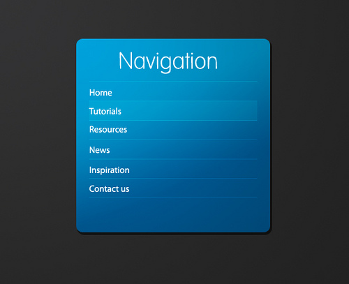
Your website’s ease of navigation is crucial for increasing the number of visitors. Organized content and clearly laid out navigation panel is an added advantage to the website design. It offers the ease of sifting through the website and also enables you to put forth necessary information like, contacts info, FAQs about the services offered by you, where to look for the archives and so on.
-
Non Relevant Style
Within seconds of opening a website, the visitor should know what kind of services the website is providing. For this, the style of the website should be absolutely relevant to the type of service that it is providing (for example, a tech style , social style, news style, magazine style etc.). If your website layout style does not match the website intentions, people may not be interested.
-
Lack Of Social-Media Integration
Promotion of a website is a very necessary tool to increase its popularity. In order to market your products and services, you need to promote your website by various means. In this day and age, utilizing the power of social-media is a must. If your website doesn’t allow social-media promotion, it’s high time you get a redesign.
-
Strong Competition
On the internet, you are not the only one providing a particular service or selling a particular product. There are numerous other people doing the same. To avoid losing your traffic to your competitors, do some competitive research. Look out for the flaws that your website has and theirs don’t. Note the level of their websites’ overall feel. If needed, take the opinion of your friends to guide you where you need to match your competitors.
-
Absence Of Call To Action
If your website is selling something, conversion of visitors to customers is the very objective of the website. Your conversion rate can be poor if you do not keep updating your landing page or if the landing page is not properly linked to your main page or has other design flaws. In addition, call to action is equally important for both — service providers and product sellers. Always include a call to action/poll in your website.( example-” To buy now click here” or “Share your experience with us” etc.)
-
Excessive Use Of Flash, Frames And Splash Pages
These effects can give a very interesting look to your website no doubt, but search engines have difficulty in reading them. So, generous use of these effects can considerably reduce your ranking in the search engine, thereby reducing traffic.
-
Poor Typography
We all know that reading a content on the computer is much harder than reading it on paper. Therefore, the eyes of a visitor should be able to easily distinguish each word to provide non-stressful reading. If the fonts used on your website’s content are too big or too small or if spacing of the text is not proper, uniform and optimal the content will look very crowded and the visitors will avoid reading them.
-
Distractive Graphics
Shiny or blinking overlay graphics can give a good look to your website but they also distract user attention from the content. Avoid using overlay graphics to help visitor’s focus on the content.
-
Cross-Browser Compatible
Your website needs to be compatible with all major browsers that people use. If this is not so, you are bound to lose a very huge amount of traffic.
Does your website need a re-design?


